The short answer
The colours that work on a Central Florida house are decided by three things before taste enters: what the community architectural rules allow, what the fixed elements already commit you to — roof, pavers, stone and window frames — and how much light the colour reflects. Light reflectance value, printed on every colour chip on a scale of 0 to 100, is the most useful number in the decision and the one most people ignore.
Exterior bodies in this climate skew light for durability rather than for energy. Deeply saturated colours absorb more heat, put more thermal stress on stucco and fade faster on the south and west elevations, which is why saturated colour belongs on the front door, the shutters and the trim, where repainting is cheap.
No colour can be chosen from a chip or a screen. Paint two coats on a white board at least two feet square, move it around the house, and look at it in morning light, midday light and after dark before deciding.
Key takeaways
- Light reflectance value is the objective specification behind a colour name. Comparing two colours by LRV tells you more than comparing their names.
- The roof, pavers and stone are already chosen and cannot be repainted. The body colour has to work with them, not the other way round.
- Saturated exterior colours fade fastest on south and west elevations, which is where the sun spends the afternoon in Central Florida.
- Most solar heat gain in a Florida house comes through the roof and the windows, not the walls. Wall colour is a durability decision far more than an energy one.
- In an open plan you are not choosing a colour for a room. You are choosing one colour for every space visible from the front door.
- Sheen changes how a colour reads. The same colour in a higher sheen looks lighter, reflects more and shows every imperfection in the wall behind it.
Best Exterior House Painting Colors
An exterior colour scheme in Central Florida is chosen inside a set of constraints, and the constraints are not a limitation on the result — they are what makes a scheme look considered rather than arbitrary. Working out what is already fixed takes an afternoon and eliminates most of the field.
Three things decide the palette before taste does
The community rules come first. Master-planned neighbourhoods across the region operate approved palettes and architectural review, and in some places the rule is tighter than a palette — it is a short list of schemes tied to your specific elevation. This is normal around Horizon West, and it is stricter still in a town like Celebration, where the design standards are part of what the community is. Find out what is permitted before falling in love with anything.
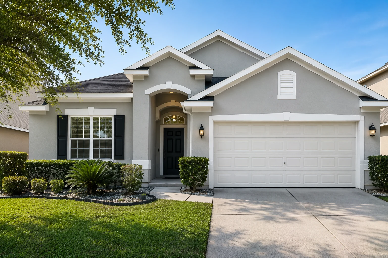
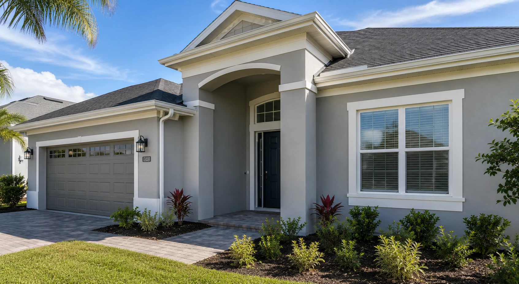
The fixed elements come second, and they matter more than most people expect. The roof, the pavers, the stone or brick accents and the window frames are already chosen, will not be repainted, and are a large share of what the eye sees. A grey shingle roof, a warm-toned paver driveway and white vinyl windows have already narrowed the sensible body colours to a handful before you open a fan deck.
The street comes third. A house is seen next to its neighbours, and a colour that is beautiful in isolation can be the one that does not belong. This is a matter of relationship, not conformity: reading the tones already on the street tells you whether the house should recede or stand slightly apart.
The number on the chip that actually helps
Every paint colour carries a light reflectance value, an LRV, on a scale from 0 for absolute black to 100 for pure white. It is a measured property, not a description, and it is the most useful thing on the chip because it lets you compare two colours objectively when their names tell you nothing.
Used well, LRV answers questions taste cannot. It tells you whether two “greiges” from different ranges are actually the same weight of colour. It predicts whether a body colour will look washed out under direct sun, which is a real risk in Florida because intense light lifts the apparent value of everything. And it explains why a colour that looked right on a shaded elevation reads pale on the one facing the afternoon.
The honest version of the colour and heat argument
Light exterior colours are frequently sold as a way to keep a house cooler. The physics is real — a darker surface absorbs more solar radiation and gets hotter — but the size of the effect on a wall is routinely overstated.
Most solar heat gain in a Florida house arrives through the roof and the windows. Field research by the Florida Solar Energy Center, measuring occupied Florida homes before and after applying reflective roof coatings, recorded average air-conditioning savings of around 19 per cent, with individual results ranging from 2 to 43 per cent. That is a substantial number, and it is about the roof — the surface that faces the sun directly for most of the day. A vertical wall receives far less, and its colour does correspondingly less.
Directions that hold up in this climate
| Direction | Why it works here | Where it fails |
|---|---|---|
| Warm white and off-white | Reflects heat, ages gracefully, suits stucco | Shows dirt and mildew streaks without washing |
| Soft greige | Neutral enough to sit with grey roofs and pavers | Can read cold beside a warm-toned roof |
| Sand and clay tones | Warm without saturation, hides dust | Competes with terracotta roof tile |
| Muted sage or olive | Sits well with Florida planting | Reads grey in shade, green in full sun |
| Pale coastal blue | Cools a west-facing elevation visually | Fades faster than the neutrals beside it |
| Deep accent on small areas | Personality where repainting is cheap | Loses saturation quickly on a west elevation |
The pattern in that table is the one to carry away. The first five are body colours because they are stable under intense light. The last one is a strategy rather than a colour: saturation belongs on the front door, the shutters and occasionally the garage door — small, replaceable areas where a change of mind costs an afternoon rather than a full repaint. The economics of that decision are worth understanding alongside the cost of painting a house, because the price of a colour is really the price of the next repaint.
Popular Interior Painting Colors
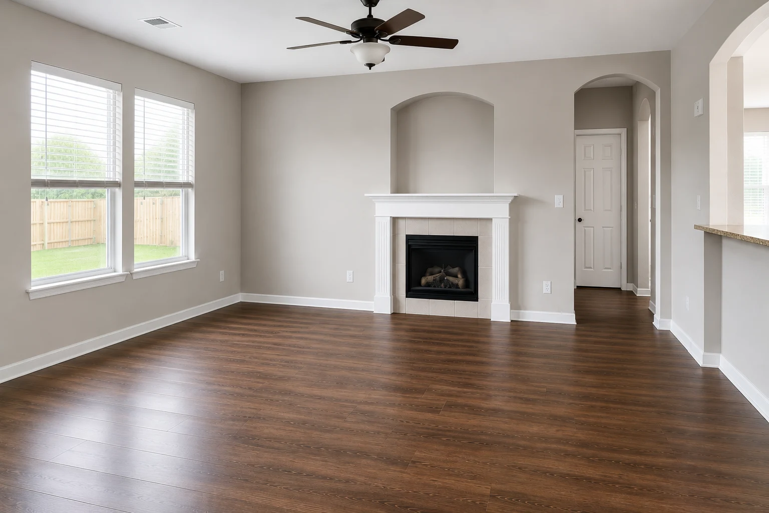
Interior colour in Florida is shaped by a specific kind of light: bright, high-angle for most of the year, and frequently bounced off pale hardscape, a pool deck or a screened enclosure before it reaches the wall. Colours behave differently here than in the photographs they were chosen from.
What Florida light does to an interior colour
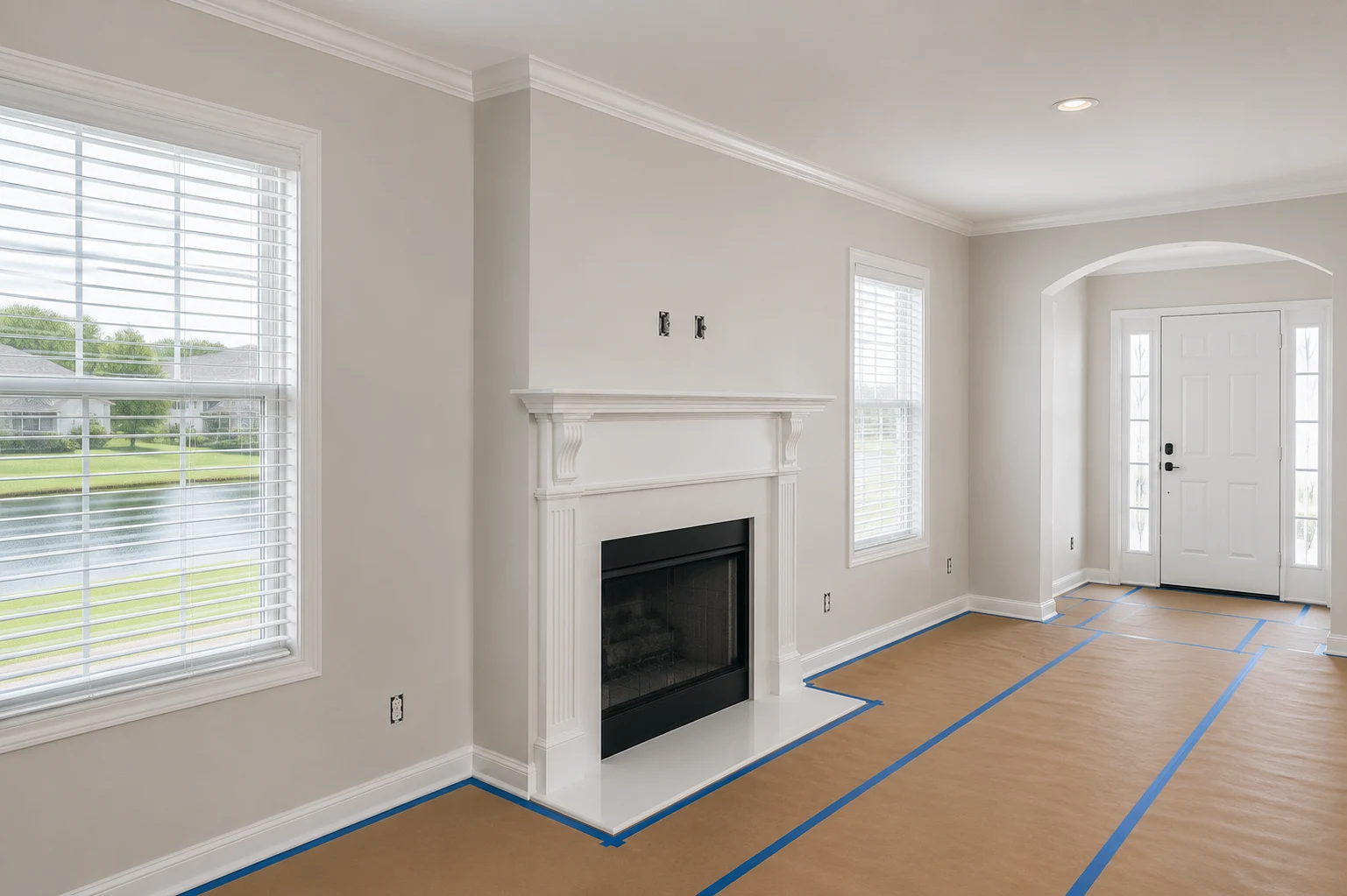
Reflected light carries the colour of whatever it bounced off. A room facing a lawn takes a green cast through the afternoon; a room opening onto a screened lanai receives light filtered grey-green by the mesh; a room facing white paver decking gets a flood of neutral light that lifts everything. None of this appears on a chip held indoors under a showroom light.
The practical consequence is that undertone matters more than colour family. A beige with a pink undertone that looks warm and safe in a store can read distinctly pink on a south-facing wall at four in the afternoon, and it is the undertone rather than the colour that people end up disliking.
One colour, several rooms
Most Central Florida houses built in the last three decades have open plans, and that changes the unit of decision. You are not choosing a colour for the dining room. You are choosing one colour for everything visible from the front door.
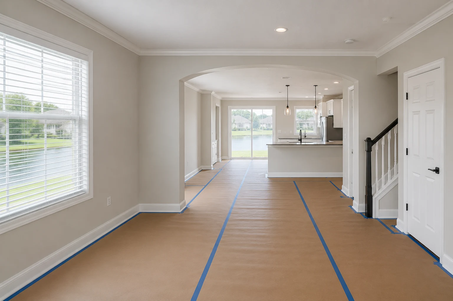
That is the practical case for a warm neutral base through the connected spaces, with character introduced by the things that are not paint: the cabinetry, the counters, the floor and the textiles. It is also why interior colour is easier to settle after the kitchen selections are made rather than before — the cabinets and counters are the fixed elements indoors, exactly as the roof and pavers are outdoors.
Rooms that close with a door are where a deeper or more distinctive colour is safe. A study, a powder room, a bedroom: each is a self-contained visual field, so a strong choice there does not have to negotiate with four other spaces.
Sheen changes the colour
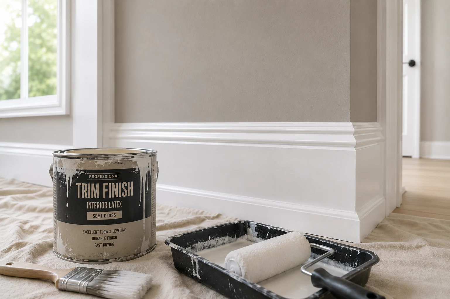
Sheen is usually discussed as a durability decision — the subject of choosing an interior paint sheen — and it is also an optical one. The same colour in a higher sheen returns more light, so it reads slightly lighter and considerably more reflective, and it emphasises the surface underneath it — every roller mark, patch and imperfection in the drywall or the stucco texture.
Flat and matte finishes absorb light and hide the wall. Higher sheens bounce it and reveal the wall. On a long open-plan wall raking with afternoon light, that difference is more visible than a two-step change in the colour itself, which is why a sample board should be painted in the sheen you actually intend to use.
How to Test Paint Colors Before Committing
This is the step that gets skipped, and it is the only one that reliably prevents an expensive mistake. A whole-house repaint is one of the largest surfaces of colour anyone commits to, and the decision is usually made from an object the size of a postcard.
What an online visualiser can and cannot do
Digital visualisers are genuinely useful for one job: narrowing a wide field to a short list. Seeing an approximate scheme on an approximate house eliminates the directions that are clearly wrong, quickly and for free.
They cannot make the final decision, and it is worth being clear about why. A visualiser renders a colour on a photograph taken under someone else’s light, then displays it on a screen whose brightness, colour temperature and calibration are unknown. The two variables that decide how a colour behaves — your light and your fixed elements — are precisely the two the tool does not have. Use it to get to three candidates, then stop.
The sample method that works
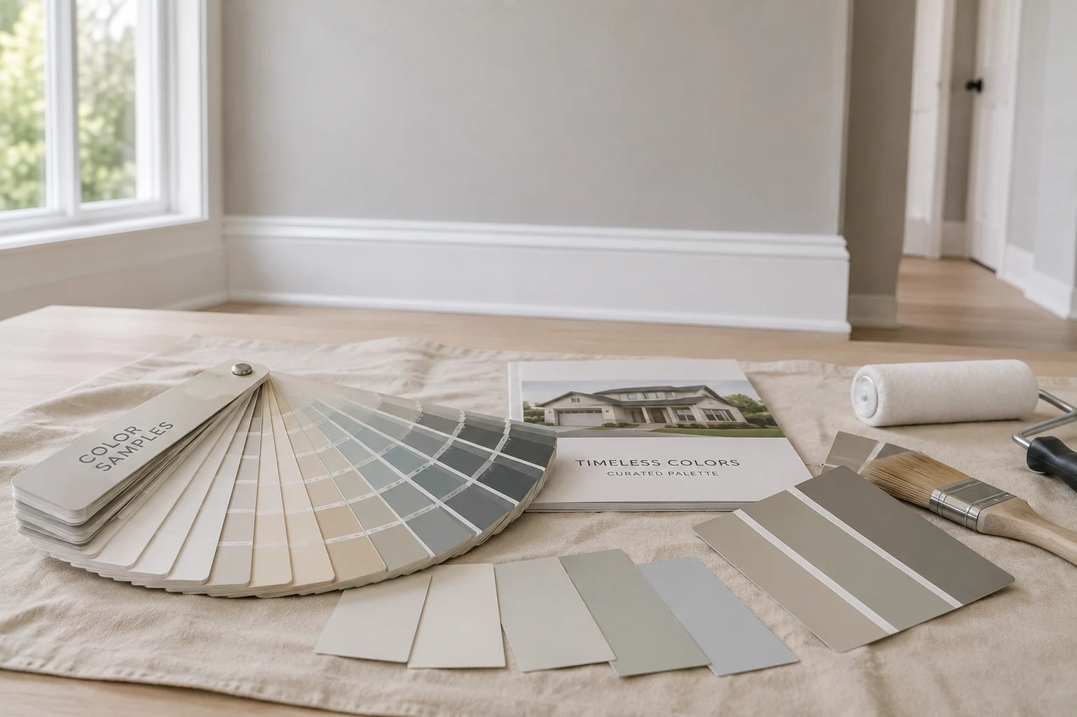
Paint two coats onto a rigid white board, primed the same way the wall will be, at least two feet square. Do not paint samples directly onto the existing wall colour: the old colour underneath alters what you see, and the patch you are judging is surrounded by the very colour you are trying to replace.
Then move the board around. Outside, hold it against every elevation in turn and next to the roof, the pavers and the window frames rather than against the sky. Inside, stand it against each wall of the room, including the darkest corner and the wall opposite the window.
Look at it at least three times a day — morning, midday and late afternoon — and once after dark under your own light fittings, which is when half the life of an interior colour actually happens. Leave the boards in place for several days. Colours that are still right on the fourth day are usually right.
Before the order goes in
Three checks are worth making once the colour is chosen. Confirm the sheen for each surface, because the same colour is a different product in each. Confirm the association submission is approved and on record, not merely sent; how HOA colour approval works covers what the submission needs. And order the full quantity for each colour at once, since paint is tinted in batches and a topped-up gallon mixed weeks later can differ enough to show on a long wall.
A colour decision made this way is the cheapest part of the project and the one that determines whether the rest of it looks right. The painting itself is a few days of work; the colour is what the house wears for the next decade, and it is worth building the scheme at the same time as the other visible decisions in a broader home renovation rather than as an afterthought once everything else is finished.
Share this article